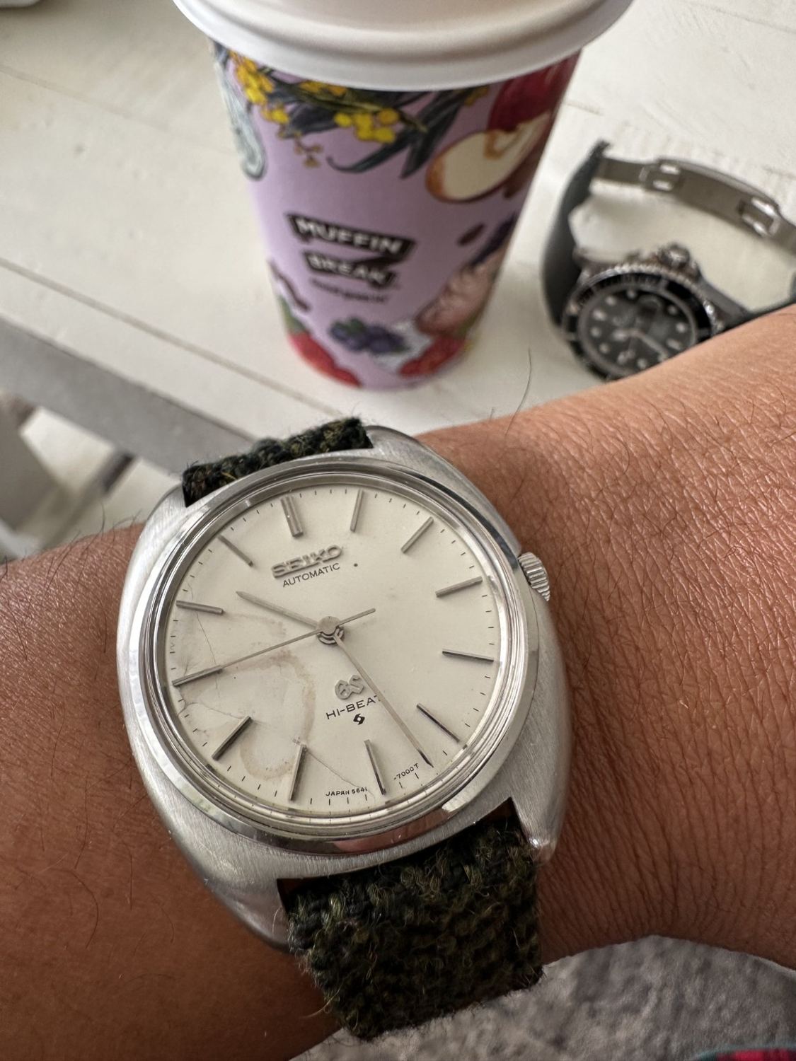
I don’t want every watch in my collection to look as though it has just arrived from a showroom. This Grand Seiko appeals to a different part of my taste: a simple no-date dial, an aged surface and a broad little case on a textured strap. The marks are obvious. I can enjoy the way they change its character without pretending that every stain is valuable patina or that condition no longer matters.
At thirty, I like that this watch feels visually removed from the current habit of making everything bigger and louder. It has plenty to look at, but none of it relies on a brightly coloured timing bezel. The dial code points towards the 5641 branch of the 56GS family, subject to checking the case and movement. That is the historical starting point for this review. My 6.5-inch wrist gives me a particular reason to appreciate a case that earns presence through its shape rather than an excessive span.
What the historic specification means
Grand Seiko’s official history places the 56GS in 1970 and describes an automatic eight-beat movement developed for a thinner, more user-friendly watch. Eight beats per second corresponds to 28,800 vibrations per hour. This is the appropriate family context for the apparent 5641 dial, rather than borrowing the five-hertz specification of other historic Hi-Beat lines. The historical aim is as interesting as the number: everyday usability was part of the engineering brief, not a secondary benefit discovered decades later by collectors.
The no-date layout makes that brief visible. There is no calendar window to interrupt the hour markers and no extra complication to discuss at three. The broad lower dial has room for the GS emblem and Hi-Beat wording, while the upper half remains centred on Seiko and Automatic. The result is more open than many contemporary sport watches. It is not empty. The distance between the slender markers and the minute track gives each element enough space to be read individually, even against an aged surface with uneven tone.
A compact-looking case on my 6.5-inch wrist
What works for me is the broad shoulder around the dial. The case looks almost cushion-like from this angle, so there is a satisfying amount of metal without long lugs reaching towards the edges of my wrist. In my photograph, there is still room beyond the ends of the case. That gives it a contained appearance even though the pale, open dial makes it look quite substantial.
I’m not attaching an exact diameter to it until the reference is confirmed. More useful to me is the relationship between the case, crown and strap. The crown gives the right side a small point of emphasis; the woven band pulls the whole composition back towards casual clothes. On a smaller wrist, that feels visually balanced. Actual height depends partly on the strap construction underneath, so a top-down image only tells part of the fit story.
Why I like the woven strap
The dark woven strap is a big part of why this combination interests me. It adds texture without adding shine. Against the pale dial and smoother case, it feels relaxed enough for a tee or a knit rather than demanding a formal shirt. I don’t see a vintage watch as something that must always be dressed exactly as it might have been decades ago. A present-day strap can give it a new visual context without altering the watch itself.
For my wrist, I’d favour a band that curves down promptly and doesn’t bunch beneath the case. If the material passes underneath, that extra layer can raise the head and change its balance. Moisture and drying time matter too, especially in warm weather. I like the appearance of cloth, but that doesn’t make every woven band automatically breathable, soft or comfortable. Those are details I would assess from the actual strap rather than its photograph.
Patina, damage and what not to romanticise
The discolouration on the dial gives this example its strongest individuality. It is also a condition issue. Describing every mark as desirable patina would conceal the fact that staining can have several causes and may affect collector preference differently. The image cannot establish whether moisture once entered the case, whether the surface has stabilized or whether any restoration has occurred. A thoughtful review can appreciate the appearance without treating deterioration as automatic proof of authenticity. Beauty and condition reporting should remain separate conversations, even when both concern exactly the same dial.
The hands and markers still provide a readable hierarchy. Their long, narrow forms preserve the restrained layout despite the marks beneath them. The pale dial creates plenty of visual area, which can make the watch seem larger than a dark-dial watch with a thick bezel. This is another reason I don’t judge fit on diameter alone. Two similarly sized watches may occupy the wrist differently because one displays mostly dial while the other displays mostly case and bezel. Here, the open face supplies much of the presence.
The historical detail I want to get right
The best research often makes me less eager to guess. The Grand Seiko Guy’s original-catalogue study is useful because it treats this period as a range of specific configurations. I want that same care here. A familiar dial doesn’t tell me that every component is original, or that the movement underneath is the one I expect.
The distinction between eight-beat and ten-beat Grand Seiko movements is particularly worth keeping. Hi-Beat isn’t a universal promise of 36,000 vibrations per hour across every historical family. I find the 56GS aim of a thinner, practical automatic watch interesting in its own right. It doesn’t need a bigger number borrowed from a different movement to make it worth collecting. For me, understanding what the watch actually is adds more than a confident-sounding description.
Where it fits in my collection
I see this as the counterpoint to the more polished pieces. It doesn't need the Zenith's registers or the Submariner's colour to hold my attention. The long markers and open dial do most of the work. The woven strap makes that restrained face easier to picture with ordinary casual clothes, which is important to me. I don't want age to turn a watch into something I can only appreciate in a box.
The condition questions stay part of the picture. I like the individuality of the dial, but I wouldn't treat discolouration as a guarantee of originality or a reason to ignore the movement. There is room to appreciate an imperfect surface and still care about what caused it. That balance is what attracts me to vintage: an older object with a distinct appearance, considered carefully enough that the story stays attached to the actual watch. For my collection, that gives it a role a brand-new alternative couldn't simply replace.
Verdict
This is the one I like for its restraint and individuality. The dial is imperfect, the case has a soft, compact-looking outline, and the woven band makes the whole thing feel approachable. My taste is not for restoring every visible trace of age away, but I still want honest condition reporting and a healthy movement. On my 6.5-inch wrist, the photograph shows presence without sprawling lugs. It is a reminder that a watch can be interesting because of what it leaves out as much as what it adds.