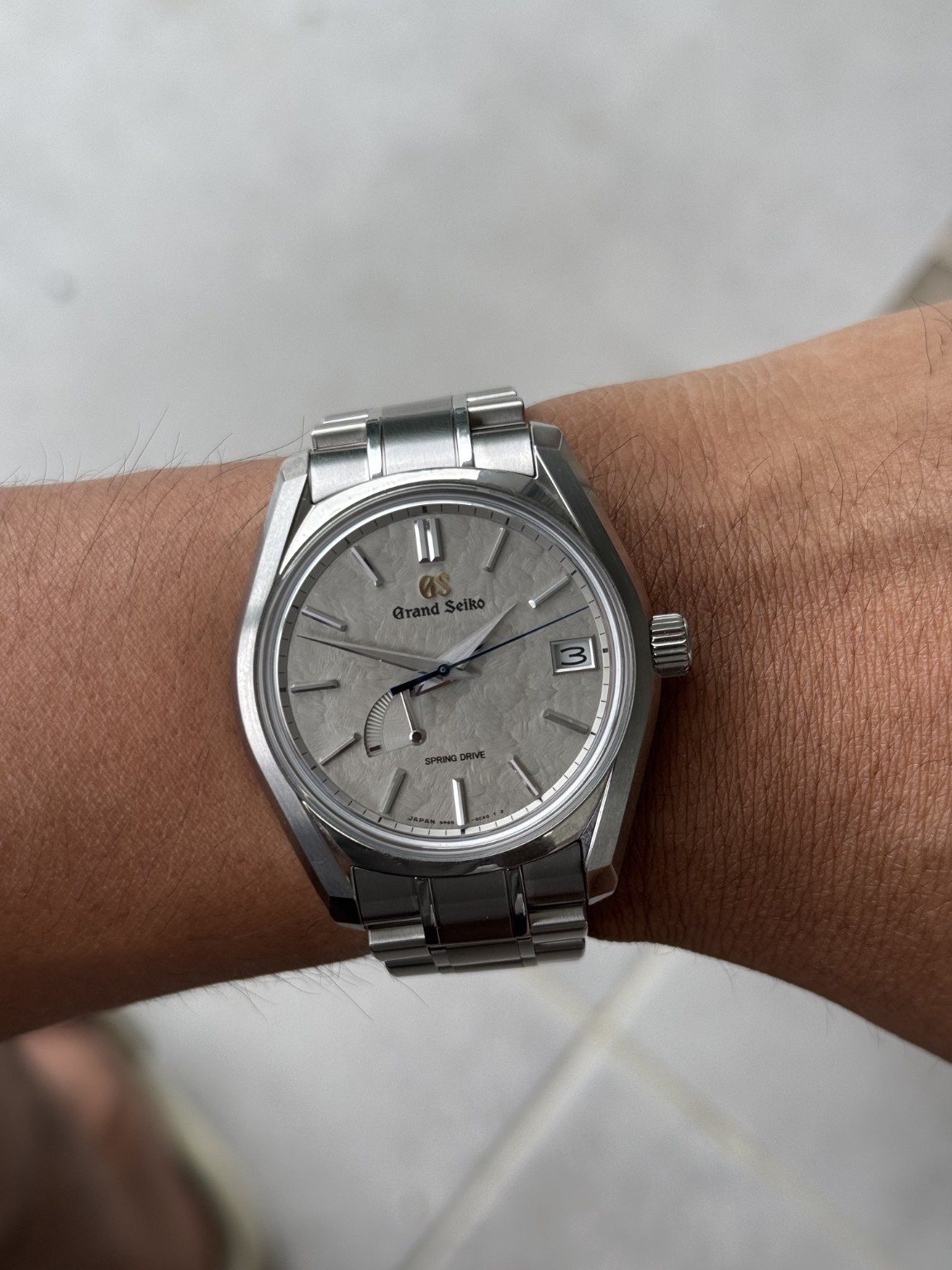
This is the watch I’m drawn to when I want the interest to be in the details. There is no bright bezel doing the talking. Instead, I get a pale, textured dial, very crisp markers and a blue seconds hand that gives the whole thing a point of focus. The grey surface has a softness that I find more engaging than a completely flat silver dial. It is quiet from a distance and much more involved when I look closely.
That balance appeals to me as a thirty-year-old who wants a watch to work with professional clothes without feeling like part of a uniform. My example looks consistent with the SBGA415 Winter, although I still need the reference confirmed. I’m using that model’s documented dimensions as a comparison, rather than silently assuming the picture proves every specification. For my 6.5-inch wrist, the interesting question is how that sculpted case uses its space, not just whether forty millimetres sounds safe.
The specification worth understanding
For the documented SBGA415, Grand Seiko lists a 40mm case, 47mm lug span and 12.8mm thickness, with a high-intensity titanium case and bracelet. The maker specifies calibre 9R65, an approximately seventy-two-hour reserve and a stated monthly accuracy of plus or minus fifteen seconds. Those figures belong to that reference. They explain why the configuration interests enthusiasts: a relatively compact upper outline, meaningful mechanical autonomy and the prospect of low mass. The numbers are useful together; quoting diameter without thickness or material would leave the wearing story incomplete.
Spring Drive itself combines a mainspring with electronic regulation. Energy originates in the wound spring, while a quartz oscillator and integrated circuit help regulate the glide wheel. It is not a conventional escapement-driven mechanical movement, nor is it simply a battery-powered quartz watch with an elaborate dial. The interest lies in the combination of stored mechanical energy and a different regulating system. The moving seconds hand is part of that appeal. In a still image, we can see its blue finish, but not the continuous glide that gives the system its visual signature.
Texture without a loud colour
The dial has enough variation to remain interesting even in subdued light. Its grey tone keeps it distinct from a plain white sports-watch face. The polished markers appear brighter at some angles and darker at others, creating contrast through geometry rather than paint. The blue hand introduces colour without breaking the overall restraint. The date window is cleanly framed, although its straight edges interrupt the organic surface. This is the central design tension: a landscape-like texture is being asked to share space with the practical instruments of ordinary timekeeping.
The reserve display is the more contentious interruption. It occupies a substantial portion of the lower-left dial and gives the face a visual weight opposite the date. An owner who rotates watches may appreciate having the remaining energy visible before fastening the bracelet. Someone who wants an uninterrupted dial may find it unnecessary on the front. Both responses are coherent. The indicator makes the watch more informative while making the composition less pure. In this photograph, its dark outline remains subordinate to the hands, which keeps the time itself easy to locate.
Proportions on my 6.5-inch wrist
The photograph gives me a pleasing balance: a generous dial, short-looking lugs and a bracelet that turns down close to the wrist. The watch has enough presence to look deliberate, but the case doesn’t seem to stretch into a long platform across my arm. I especially like the way the different planes stop the sides becoming one big shiny wall. There is a lot of shape here without the visual bulk of a diver’s bezel.
For the SBGA415 comparison, the 47mm lug span matters to me alongside the 40mm diameter. The 12.8mm thickness matters too: compact from above doesn’t mean especially thin under a shirt cuff. If the identification is correct, titanium is an important part of the expected feel. I like the idea of this much visual substance with less physical weight, but bracelet sizing still determines whether a light watch feels stable or simply loose.
Why the Winter keeps my attention
The useful point I take from Beans & Bezels’ SBGA415 review is how central titanium is to the wearing proposition. Its sized example was reported at roughly ninety grams. That isn’t a measurement of mine, but it helps explain why judging this design by the appearance of its metal alone can be misleading. I don’t need a watch to feel heavy to consider it well made.
Hodinkee’s introduction of the Seasons collection gives useful context for the Winter dial and its relationship with light. What interests me personally is the contrast between the irregular texture and those very precise hands and markers. I’d happily trade a loud colour for that kind of detail. It also makes this a good counterpoint to the Submariner: both have a date and a practical layout, but they attract my attention in completely different ways.
The bracelet, the cuff and the workday
The bracelet is visually restrained, which is exactly what I want beside this case. A more decorative link pattern would compete with all those reflective edges. On my 6.5-inch wrist, I’d want the clasp centred and the links adjusted so that the watch head stays where I put it. A few millimetres of poor sizing can matter more than a glowing review of the case finishing.
For work, I like the neutral palette because it doesn’t dictate the rest of my clothes. Grey, blue and a small warm GS emblem are enough. The complication I’m less completely sold on is the front power-reserve display. I understand its usefulness, particularly in a rotation, but I can also see the argument for leaving that textured dial uninterrupted. That tension makes the design more interesting to discuss than simply calling every choice perfect.
Where it fits in my collection
This is the one I associate most easily with a professional wardrobe. Grey, white and blue give me enough colour without dictating the rest of an outfit. I like that the interest remains close to the wrist: texture, small reflections and the distinction between a precise hand and an irregular background. There is something appealing about a watch that gives the wearer more to look at than the person across the table.
The comparison with the vintage Grand Seiko matters too. Both have pale dials, but their character comes from different places. The older watch has age and simplicity; this one has deliberate texture and a more visibly technical display. I wouldn't want to choose between them solely on a specification table. What interests me is having those different expressions of the same broad design values in a collection. The Spring Drive supplies the more contemporary answer, with a bolder case and a distinctive regulating system behind the quiet face.
Verdict
My favourite thing here is the contrast between calm appearance and an unusual regulating system. The dial rewards a closer look, while the case gives it enough structure to avoid becoming overly delicate. For my taste, the blue hand is the right amount of colour. The reserve indicator is a compromise and the thickness deserves attention on a smaller wrist. Even so, this is the watch in the collection that most strongly reflects my interest in engineering that doesn’t need to announce itself from across the room.