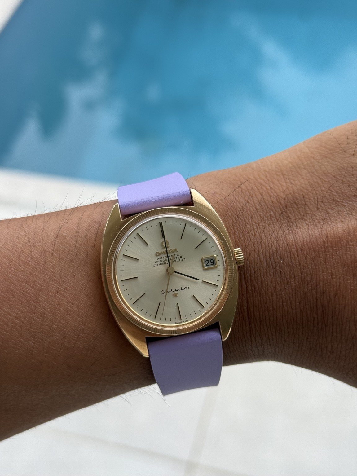
The lilac strap is the part of this Constellation that makes me smile. A warm-toned vintage Omega could easily look quite formal, but this colour takes it somewhere more relaxed. I like the contrast because it doesn’t ask the watch to pretend it is new. The dial still has that measured, slightly old-fashioned composure; the strap just stops the whole thing feeling reserved for a special occasion.
My taste at thirty is a mix of appreciating the original design and wanting to make it work with my own clothes. This is a good example. The broad C-style case and fine markers give me the period character, while the simple coloured band adds something current. The exact reference, metal and movement still need confirming. A gold-coloured photograph isn’t proof of solid gold, so I’m leaving that claim out. What I can talk about confidently is why this particular combination appeals to me, especially on a 6.5-inch wrist.
A case that does more than frame a dial
The case shoulder is the important shape. It flows around the face and towards the strap opening, reducing the visual separation between a round watch body and projecting lugs. The effect is compact and cohesive. Instead of four narrow legs, I see one continuous metal object. That can give a modestly sized vintage watch more presence than its diameter would suggest. It is especially apparent here because the strap begins within the broader outline, making the case look like a deliberate solid form rather than a dial suspended between attachments.
The bezel and upper shoulder also produce different reflections. The narrow ring around the crystal catches light close to the dial, while the wider body remains comparatively calm. This layered treatment keeps the case from becoming one undifferentiated gold-coloured surface. It is an effective answer to a common styling problem: how to make a warm-toned watch interesting without covering it in ornament. The form supplies that interest. In this photograph, the polished details are present, but the outline remains more memorable than any single flash of reflection.
Dial discipline
The hour markers are fine enough to leave generous empty space. The date occupies a neatly bordered opening at three, and the Constellation script and star give the lower dial a point of focus. The wording above the hands records automatic and chronometer identity without filling the face. The result is formal but not severe. There is an appealing relationship between the almost technical straight markers and the softer script below them. Neither element dominates. The absence of a large outer timing scale also allows the dial to feel open and unhurried.
The hands are slender relative to the case, which strengthens that restraint but gives less visual contrast than a modern sports watch. In some lighting conditions, reflective hands and a pale dial can approach the same tone. That is a reason to examine the watch in ordinary indoor light rather than only in a flattering photograph. It does not mean the layout is inherently illegible. The photograph shows a clean hierarchy. The question for an actual fitting is whether the hierarchy remains clear as the wrist turns, especially when a sleeve casts a shadow.
Lilac, a 6.5-inch wrist and a different attitude
I like that the strap doesn’t try to match the case. The lilac is a separate colour, with a soft-looking, simple surface that leaves the watch head in charge of the detail. It feels visually lighter than adding another expanse of gold-toned metal. Against casual clothes, that is the point: I want the Constellation to have character without looking as if I’ve borrowed a formal accessory from another era.
In my photograph, the case looks contained on the wrist and the strap bends away without creating a long rigid extension. For my 6.5-inch wrist, that compact outline matters more than a guessed diameter. The broad shoulder supplies presence even though the lugs don’t project like four separate legs. Physical comfort would still depend on strap flexibility and buckle position. The poolside background is a colour setting, rather than evidence that an older watch is ready for swimming.
The vintage details that matter to me
Omega’s Constellation C archive gives a useful reference point for the family. Fratello’s Constellation study adds context for its chronometer heritage. That history makes the restrained dial more interesting to me: there is a technical identity behind the script and star, rather than decoration alone.
I would still separate the original ambition from the present condition of a vintage movement. Chronometer wording doesn’t tell me its current daily rate, and a modern Constellation’s specifications don’t describe this earlier watch. I’d rather know the actual caseback and movement details before discussing reserve or service parts. For me, getting the identity right is part of appreciating an older watch, not an obstacle to enjoying it. The visible shape already gives it a strong enough personality without an invented year or calibre.
A bit more personality than a black strap
This combination has a definite point of view, and I like that. The case brings warmth, the pale dial keeps the centre open, and the lilac gives the watch a relaxed edge. For a younger collector, it is a reminder that vintage doesn’t have to mean dressing formally or copying a catalogue photograph. I can enjoy a period design while choosing a very current colour around it.
The compromise is that the band isn’t neutral. A dark leather strap would make the watch easier to blend into a formal outfit, while this one is more of an accent. I’d be happy to make that trade visually, especially with a plain tee or an open-collar shirt. It changes the mood without changing the dial, hands or case. That reversibility is one of the pleasures of straps: a different setting for the same object, rather than a different watch entirely.
Where it fits in my collection
The combination works best in my mind when the rest of the outfit is simple. A neutral shirt, ordinary trousers and this one unexpected colour would be enough. I don’t want the strap to turn the watch into a novelty; I want it to make an already attractive design feel more like mine. The fine markers and small star give the colour something restrained to sit beside.
There is also an interesting comparison with the orange Submariner. Both straps change a recognisable watch, but the effects are different. Orange amplifies the diver’s energy. Lilac softens the Constellation’s formality. That is why I enjoy looking at configurations rather than only model names. The head establishes the basic design, but the band can determine whether I picture it with professional clothes, a weekend tee or something in between.
Verdict
The C-case gives this Omega its structure; the lilac strap gives it a sense of humour. That is why I like the combination. The watch looks compact and self-contained on my 6.5-inch wrist, yet the warm shoulder around the dial gives it more presence than a thin round dress watch. I’d keep an eye on legibility in changing light and get the reference and condition properly documented. As a piece of personal styling, though, this is one of the most individual watches in the group. It respects the old design without making it feel untouchable.