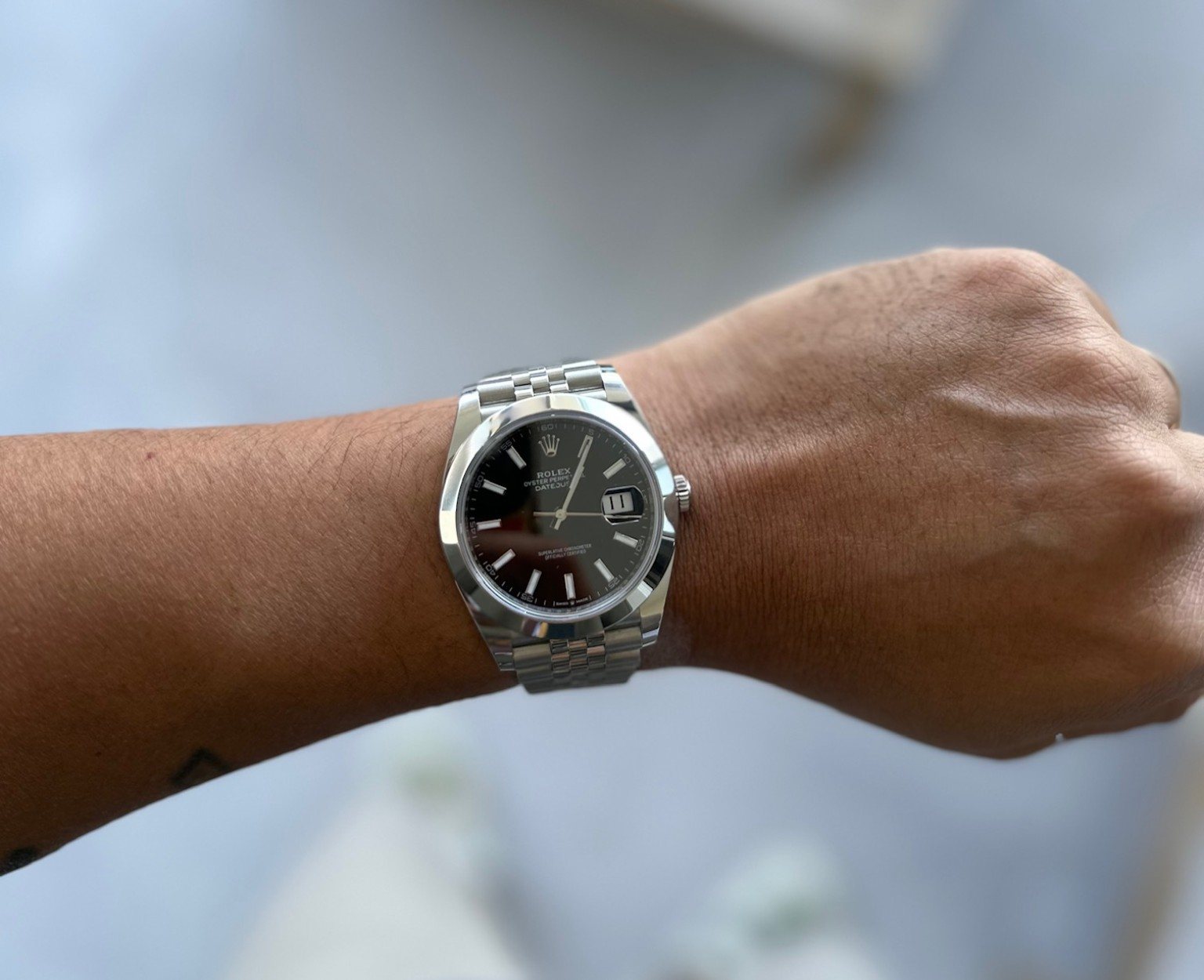
The Datejust is the watch I’d put forward when somebody says a sensible choice has to be a boring one. Mine has a dark dial, a smooth bezel and the fine texture of a Jubilee-style bracelet. That combination is enough. I don’t need a coloured bezel or a complicated dial to make it interesting. The appeal is in how those few surfaces work together, with the polished ring giving the watch a cleaner outline than the more familiar fluted configuration.
For the way I like to dress, this makes a lot of sense. I want a watch that can sit beside professional clothes without looking like something I only bring out for work. On my 6.5-inch wrist, I care about the whole silhouette: the dial opening, the bracelet’s first links and how quickly they turn down. The exact reference and diameter still need confirming, so I’m keeping the specification discussion tied to identified comparison models. My interest in this example starts with its proportions, not an assumed movement number.
The bezel is the choice that defines it
Without fluting, the bezel reads as one unbroken surface. It gives the watch a simpler outline, but the polished area is broad enough to remain conspicuous. Under some light, a smooth bezel can look almost white; under other light it becomes dark and mirror-like. The photograph catches that movement between tones. Calling the result understated is only partly right. It is less intricate than a fluted bezel, yet it can still be highly reflective. The restraint lies in the number of details, not necessarily in how little attention the metal attracts.
That plain ring also shifts the bracelet’s role. A fluted bezel and Jubilee bracelet can echo one another through repeated facets. A smooth bezel instead lets the bracelet supply most of the fine texture. The pairing avoids complete uniformity without becoming discordant. It is an especially effective combination for someone who wants a traditional bracelet but a cleaner face. The small amount of visual tension is the attraction: one component is broad and continuous, the other finely segmented. A three-link bracelet would make the entyre watch feel more straightforwardly sporting.
Dial, date and practical clarity
The dark face gives the applied markers room to stand out. Long baton forms organise the perimeter without adding the density of numerals, and the hands preserve the same straight-lined language. The crown at twelve and date at three become the main exceptions. That makes the layout easy to recognise without needing several colours or contrasting subdials. The darker dial also reduces the apparent area of the centre compared with a bright white face. It can make a watch feel visually contained even when the surrounding polished bezel adds presence.
The Cyclops lens remains a significant design decision. It promotes the date from a small window into a much larger visual feature. For everyday use that can be helpful, but the lens also attracts reflections and introduces a raised-looking element at one side of the dial. Some people will value that immediately recognisable signature; others will prefer a cleaner display without magnification. Neither preference needs to be turned into a universal rule. In this particular composition, the plain markers and simple bezel leave enough space for the date to become the strongest individual detail.
The balance on my 6.5-inch wrist
I like the way the bracelet turns away from the case in my photograph. The watch has a substantial face, but the lugs look contained within the wrist rather than reaching beyond it. The dark dial helps visually pull the centre in, while the smooth bezel adds a bright outer boundary. It is a different sort of presence from the Submariner: less equipment around the dial, more emphasis on one clear circle.
On a 6.5-inch wrist, fine adjustment matters. The Jubilee’s small links suggest a flexible outline, but the final fit depends on the actual bracelet and clasp, not just the link pattern. I would want the head centred and enough room for changes through a warm Australian day. A bracelet that looks draped in a photograph can still be badly sized in practice. I don’t see the smaller wrist as a reason to avoid presence; I see it as a reason to pay attention to where that presence ends.
Why the everyday argument makes sense to me
WatchTime’s Datejust 41 test is useful context for the modern model. Its tested watch used calibre 3235 and an Oyster bracelet, so I’m not transferring the measured results or the exact bracelet feel to mine. What interests me is the combination of a restrained face with a technically developed movement underneath. A conservative-looking watch can still be mechanically interesting.
Stephen Pulvirent’s Hodinkee review approaches an earlier, smaller Datejust as an everyday watch. Reading those two perspectives together reinforces my own preference for looking at the configuration rather than declaring one size universally right. A Jubilee and a smooth bezel tell a different story from an Oyster and fluting. I like that the Datejust gives me those choices without losing the simple date-at-three identity that ties the family together.
How I would dress it
For me, this is the easiest watch in the collection to picture with both a shirt and an ordinary tee. The neutral colours help, but the more important detail is the balance between smooth and textured metal. The bracelet supplies enough visual movement that I wouldn’t need anything else elaborate around it. A plain sleeve lets the watch do its own thing.
I wouldn’t call it invisible. The bezel is broad and reflective, and the bracelet can attract more light than the restrained dial suggests. That is a useful distinction when I’m thinking about professional clothes: clean design and low visibility are not the same thing. I like the former here without pretending the watch always delivers the latter. It has polish in both senses, which is part of its appeal.
Where it fits in my collection
What draws me to an everyday watch is consistency of design. I want to like it with a shirt in the morning and still like it when the clothes are more casual. The Datejust doesn’t rely on a particular activity to explain itself. The date is useful, the markers are straightforward and the bracelet contributes most of the ornament. That is a convincing balance to me.
The detail I’d keep comparing against other watches is the way the pale reflections around the bezel meet the dark dial. A white dial would open the face up; this darker one seems more contained. It gives the watch enough visual weight without making every element larger. For a 6.5-inch wrist, that is a more useful conversation than a simple rule about how many millimetres a person should wear.
Verdict
The smooth bezel is what makes this Datejust work for my taste. It gives the familiar dial a cleaner frame, while the Jubilee-style bracelet keeps the watch from becoming too plain. The photographed fit looks balanced on my 6.5-inch wrist, with a strong face and a bracelet that turns down promptly. My reservations are the usual practical ones: reflective surfaces, a prominent date lens and the importance of getting the bracelet sized properly. None of that undermines the basic appeal. This is the sort of versatile, coherent design I can understand wanting to keep around for a long time.