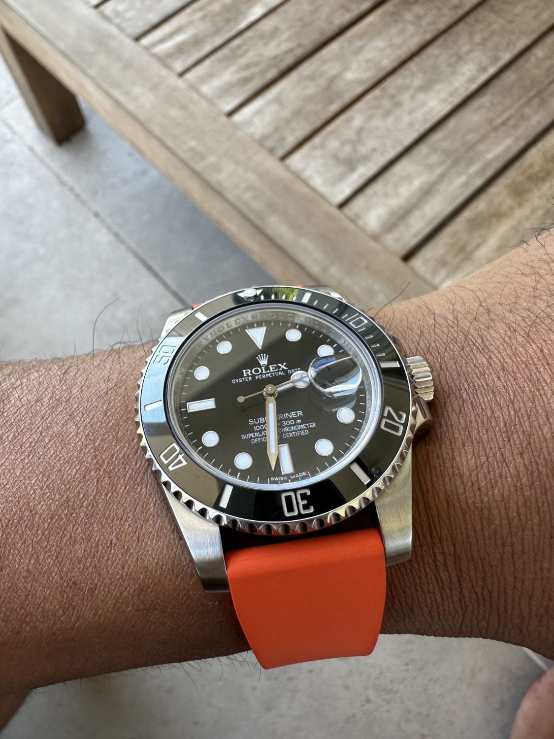
I like a Submariner more when it looks like somebody’s watch rather than an item waiting behind glass. For me, the orange strap is what makes this one feel personal. The black dial is familiar, the bezel is purposeful, and then there is this completely unapologetic hit of colour. It takes a very recognisable Rolex and gives it a much less serious attitude. That suits the way I want this collection to feel: considered, but never too precious to have a personality.
At thirty, I’m interested in watches that make sense beyond the moment somebody recognises the logo. I want something that works with the ordinary Australian wardrobe: a shirt for work, a plain tee, a light jacket when the weather turns. This isn’t the quietest option, and I like that honesty. The reference still needs confirming, so I’m leaving precise case and movement numbers out rather than guessing. The design itself gives me plenty to get into.
The face: clarity, interrupted on purpose
Round hour plots, rectangular markers and the triangle at twelve create three different visual anchors. The large minute hand has plenty of area against the black dial, while the distinctive hour hand makes the two easy to distinguish. These are useful choices, especially when the watch is viewed obliquely rather than straight on. In this image the crystal catches the sky and the bezel catches nearby greenery; despite those reflections, the broad markers remain the dominant dial elements. The design has enough contrast to survive a visually busy setting.
The Cyclops lens introduces a deliberate interruption at three. It makes the date a separate, almost raised object within the dial rather than a tiny secondary detail. Some readers will prefer the quieter symmetry of a no-date Submariner. Here, however, the lens is an essential part of the watch’s character. The photograph also illustrates its limitation: reflections and viewing angle can obscure the date even while the rest of the dial is clear. Magnification and effortless visibility are related ideas, but they are not identical in every lighting condition.
On my 6.5-inch wrist
With a 6.5-inch wrist, I pay more attention to the ends of the lugs than to the diameter printed in a catalogue. My photograph shows a substantial watch head, but there is still skin visible beyond it. The broad brushed shoulders make it look planted rather than delicate. This is the appeal of the Sub for me: it has proper sports-watch presence without needing an enormous dial. I wouldn’t describe it as a watch that visually disappears.
The strap makes a real difference to that impression. Because it bends down close to the case, the watch reads as a distinct steel head with a softer band underneath. I prefer that separation to a continuous expanse of polished metal when I want a casual look. Actual comfort still comes down to tension, buckle position and how the material behaves in heat. On a smaller wrist, I’d choose a centred, secure fit over letting the head wander towards the outside of the arm.
What I take from other Submariner reviews
I found Danny Milton’s Hodinkee review of the 124060 useful for its discussion of the newer case proportions. My takeaway is that changing lugs and bracelet width can matter more than a small increase in the headline diameter. That is relevant to my wrist, but his no-date test watch is a comparison, rather than an identification of my Date.
Hodinkee’s reference history also makes it clear why I won’t casually attach one generation’s specifications to another. The ceramic-era watches and earlier aluminium-bezel models can have quite different personalities. I’m more interested in getting that distinction right than borrowing the newest calibre number. With this configuration, the orange band changes the visual balance enough that a bracelet review only tells part of the story anyway.
Presence: orange changes the hierarchy
The strap supplies the brightest surface in the photograph. It makes the watch feel more casual, but it does not make it discreet. In fact, orange can attract attention from farther away than the case’s polished edges. The interesting effect is that it redirects attention from brand recognition to a colour combination. Black, silver and orange produce a simple, legible palette. That combination would sit naturally beside a plain shirt or outdoor jacket, while being a more deliberate styling choice with formal clothing. It is personality added through a reversible decision.
The trade-off is versatility. A black band could let the dial dominate and a bracelet could make the assembly feel more continuous. Orange asks the wearer to enjoy contrast every time the watch comes out. It also leaves the space between band and case more noticeable, depending on the strap’s end shape. Neither result is inherently better. The successful feature here is that the original dial remains visually organised while the strap introduces an entirely different mood. The watch can absorb the change without losing its identity.
The practical details I care about
My priorities are fairly unglamorous: keeping the crown clear of my hand, getting the buckle into a sensible position and having enough adjustment for a warm afternoon. A soft band isn’t automatically a comfortable band if the holes leave it either loose or tight. I also want the spring bars and strap ends to be properly compatible. Those little details matter more to me than describing every surface as luxurious.
The 300-metre wording on the dial is part of the model’s identity, but it isn’t a current pressure-test certificate. I would want service history and a proper test before relying on an older example around water. That doesn’t spoil the appeal. It simply keeps the distinction between a capable design and the present condition of one particular watch clear.
Where it fits in my collection
I like this as the less formal Rolex in the collection. The Datejust already covers clean metal, a dark dial and a bracelet. Keeping the Submariner on orange gives it a separate identity rather than asking two watches to fill exactly the same space. It also reminds me that a change of strap can be more interesting than changing the watch itself. The proportions stay recognisable, but the mood shifts immediately.
The practical compromise I would keep in mind is the height of the head at a shirt cuff. This is a sports watch with a broad case, so I wouldn't make disappearing under every sleeve part of the promise. I prefer the way it looks when the strap and case are both visible. That shows the contrast I like: disciplined black dial, brushed steel shoulders and a band that doesn't take itself too seriously. The combination has a clear personality, which is what keeps a familiar design interesting to me.
Verdict
For me, this is the Submariner with its tie loosened. I like the solid black-and-steel foundation, the broad case and the way the orange gives it a sense of fun. On my 6.5-inch wrist, the visual balance is assertive rather than oversized in the photograph. The colour costs it some versatility, and I’d never pretend it is discreet. But if I wanted total neutrality, I wouldn’t have picked orange. This is the configuration that makes a very familiar watch feel like part of my own collection.