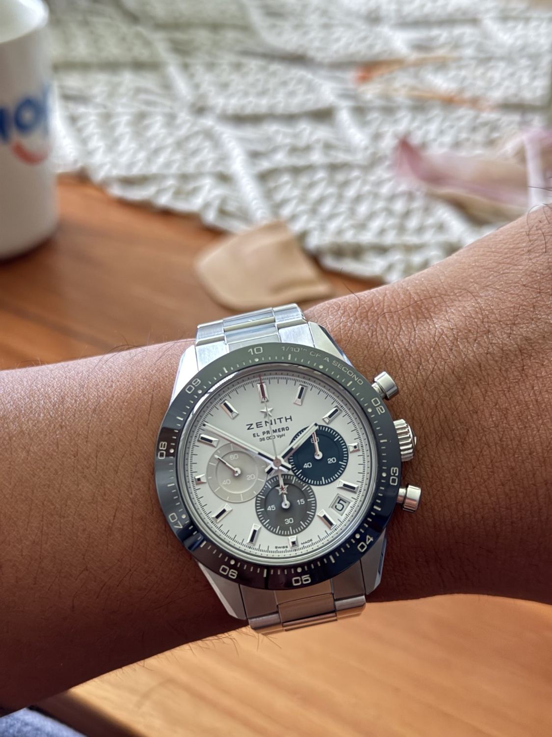
The Zenith is the watch that appeals to the part of me that enjoys a machine for what it does. I like the white dial and coloured registers, but the reason it holds my attention is the chronograph. There is something satisfying about a complication with a distinct visual behaviour, rather than another feature buried in a specification table. The black bezel gives the dial a clear frame and the blue, grey and silver counters stop it becoming anonymous.
I also like that it has a different personality from the simpler watches in my collection. This is busy, sporty and reflective, with proper pushers sticking out of the case. It doesn’t pretend otherwise. The pictured configuration is consistent with the white-dial steel Chronomaster Sport, with the exact reference still to be checked. For my 6.5-inch wrist, the key attraction is the possibility of a full-size chronograph whose short span looks manageable, even though its height and controls add unmistakable presence.
The mechanism behind the scale
The El Primero 3600 gives this model a more distinctive identity than its outline alone. In the documented Chronomaster Sport, the chronograph’s central hand makes one revolution in ten seconds, enabling a direct tenth-second display against the bezel scale. The movement operates at 36,000 vibrations per hour, or five hertz. The faster display is a chronograph function; it should not be mistaken for a promise that the ordinary time display remains accurate to a tenth of a second indefinitely. Measurement resolution and timekeeping accuracy are different properties.
That distinction changes how to enjoy the watch. The appeal is not simply that it can time something a phone can also time. It offers a visibly different mechanical performance whenever the chronograph is engaged. Reading the result requires learning the scale rather than assuming the central hand represents a conventional sixty-second lap. This is a complication with its own rhythm. In a collection containing simple three-hand watches, it provides an experience that is mechanically and visually separate, without needing a vastly larger case to make its point.
Dial organisation and the date debate
The registers overlap without losing their own borders. The darkest counter on the right becomes the strongest visual weight, balanced by the softer counter opposite it and the lower register. The applied hour markers and faceted hands stand above that information. In my photograph the hands remain easy to locate, although the reflective metal can merge briefly with the pale dial. This is the ordinary trade-off of polished details: they produce depth and flashes of contrast, rather than the unchanging clarity of matte black printing.
The date at approximately half past four is the divisive detail. It preserves useful daily information while leaving the three main registers intact, but it introduces an angled element into an otherwise strongly organised face. Its light disc blends with the dial, reducing the disturbance. Whether that is enough will depend on how strongly I value symmetry. The outer minute track, fraction scale and register graduations already make this the busiest watch in the group. The date is a small addition, yet small additions matter when the composition is working this hard.
Forty-one millimetres on my 6.5-inch wrist
The 41mm diameter doesn’t tell the whole story. Blake Buettner’s Teddy Baldassarre review reports roughly 13.6mm thickness and a 46.2mm lug span. I find those proportions more useful than the diameter alone: the short reach helps explain the compact-looking top view, while the height explains why it still has a substantial sports-watch character.
In my photograph, the lugs appear contained within the upper surface of my wrist and the bracelet turns down before reaching the edges. That is the balance I want on a 6.5-inch wrist. The crown and pushers still extend towards the hand, so I wouldn’t treat the nominal diameter as the complete footprint. I like the presence, but I would pay attention to wrist extension and cuff clearance rather than declaring the watch small simply because its lugs are short.
What I take from the wearing reports
Beyond The Dial’s review discusses fit on a 7.25-inch wrist, which is larger than mine. I use that as context, rather than assuming its comfort conclusion automatically applies to me. Read alongside Buettner’s measurements, it gives a coherent picture of a chronograph with a relatively compact span and a visibly substantial profile.
My own design preference is for that honest middle ground. I don’t need a chronograph to masquerade as a thin dress watch, but I don’t want a long case hanging past my wrist either. The photo makes the outline look promising. Bracelet sizing, clasp position and the actual protrusion of the controls are what would decide the final practical verdict. I’m more interested in those details than repeating that a popular model wears smaller than its number.
The energetic one in the collection
The bracelet makes the watch look complete to me. It gives the case a broad visual base and keeps the sporting character consistent from the dial down to the clasp. There are plenty of reflective edges, so I wouldn’t call this configuration quiet. Even with a pale dial, the bezel, counters and pushers give it a strong outline against the wrist.
On a 6.5-inch wrist, that presence can be a positive as long as the bracelet is well adjusted. I’d want enough control over the fit to stop the taller head rolling outwards. The fine adjustment available depends on the actual clasp fitted, so I wouldn’t borrow a newer generation’s feature list without checking. A strap could change the balance, but it wouldn’t make the dial less detailed. I like that the Zenith has its own unmistakable role rather than trying to overlap with the Datejust.
Where it fits in my collection
I would treat the chronograph as a small mechanical pleasure rather than pretend it improves every task. Timing a coffee or an ordinary interval doesn’t require a high-frequency movement. The enjoyment is in watching a conventional-looking sports watch display elapsed time in a different way. That is enough of a reason for me to find it interesting.
The visual counterpoint is the white dial. A darker face would change the mood, but here the pale base gives the blue and grey registers room to stand apart. I like that it can look recognisably sporty without relying on a bright strap. With professional clothes, I would let the watch be the busier detail. With a tee, the bracelet and black bezel already supply enough structure. It is the one I would choose for visible mechanical energy rather than visual restraint.
Verdict
For me, the Chronomaster Sport earns its place because the mechanics and the styling tell the same story. The active-looking dial has a genuinely distinctive timing display behind it. The photographed outline looks balanced on my 6.5-inch wrist, while the height, pushers and polished details make it noticeably sportier than my simpler watches. The trade-offs are visual density, cuff clearance and careful bracelet sizing. If I only wanted to tell the time, there would be easier ways. What I like here is having something mechanically engaging to look at and understand.